The Secret Language of Perfume Bottle Design
The semiotics and subconscious cues behind flacon shapes, cap styles, and color schemes—and how they influence buying decisions.
THE SCENT DAILY
7/15/20254 min read
Perfume is more than the aromatic elixir. It's identity, aspiration, and emotion. While fragrance itself undeniably influences choice, the often-overlooked artistry of perfume bottle design quietly speaks volumes. From graceful curves to minimalist caps, each element carries its own hidden meaning with a purpose, employing the silent yet powerful language of semiotics. These subconscious cues that brands use offers insight into how design subtly drives purchasing decisions.
The Power of Shape: Conveying Personality Through Form
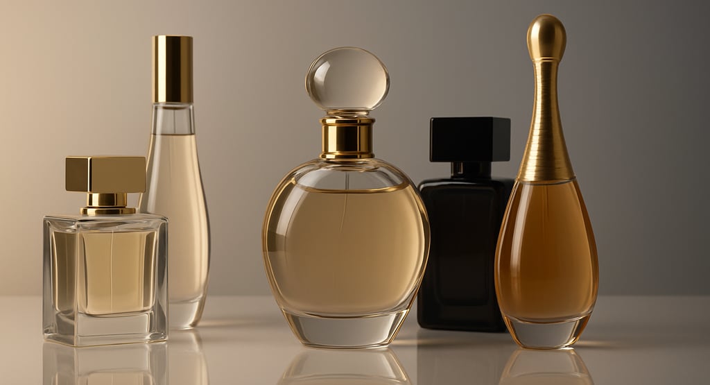
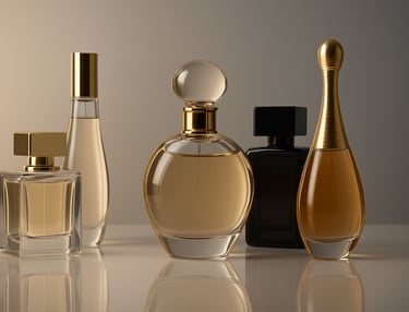
Perfume bottles—or flacons—can adopt myriad shapes, each with their own specific emotions and impressions. Rounded bottles tend to communicate softness, femininity, and sensuality because humans have been neurologically primed to find curves non‑threatening. Early neuro‑aesthetic studies from the University of Toronto showed that people consistently rate curved objects as more pleasing than angular ones, likely because sharp angles once signaled danger (think thorns or jagged rocks). Thus, a bottle like Chanel No. 5, with its gentle shoulders and softened edges, triggers the limbic system’s sense of safety and nurturance, perfect for a scent that bills itself as timeless and elegant.
Conversely, angular or facet‑cut bottles project strength, modernity, and sophistication. Sharp edges stimulate the amygdala just enough to create a response that we interpret as energy and assertiveness. Gucci Guilty’s blade‑like profile and mirrored glass play on this effect, telegraphing a daring, empowered personality that matches the fragrance’s marketing narrative.
Another interesting factor in bottle design is the shape. Slender, elongated bottles tend to give off a vibe of delicacy and refinement because vertical bottle designs metaphorically point upward—a visual shorthand for elevation, elegance, and even transcendence. Much like Gothic spires, they invite the eye to travel along their height, subconsciously framing the wearer as graceful and poised. On the other hand, compact or square bottles convey stability and reliability. Their low center of gravity mirrors architectural foundations, prompting feelings of security. When a fragrance promises lasting power or daily versatility, a stockier silhouette reinforces that message without a word of copy.
Finally, the symmetry in the bottle design is also important. Shapes that are symmetric often enhance recall in consumers as the brain processes symmetrical objects faster by freeing the cognitive load that our brain has to process. This way the brain can focus more on the scent and recall it better. You’ll also see bottles with familiar archetypes on them like a heart, an amphora, or a column. This is an effective way to tap into our collective memory associations so we can immediately understand what the scent is going to be like before trying it.
Cap Styles
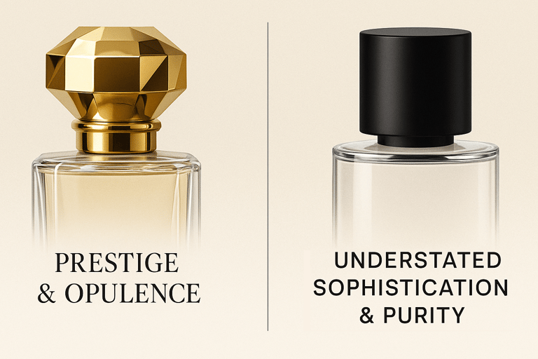
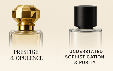
Though seemingly minor, the style of the cap profoundly impacts perceived quality and luxury. Heavy, metallic caps show prestige and opulence. Brands such as Tom Ford or Roja Dove often feature substantial, metal or crystal-like caps, which resonates with their luxury pursuit by providing tactile reassurance of quality. The heft of the cap is a non-verbal cue that the fragrance inside is equally luxurious.
On the other hand, minimalist caps, such as those frequently seen in niche or indie fragrances, speak of understated sophistication and purity. The simplicity of these designs signals exclusivity through restraint rather than excess, which is perfect for the people that buy these kinds of fragrances who are usually looking for something unique yet authentic.
Color Schemes
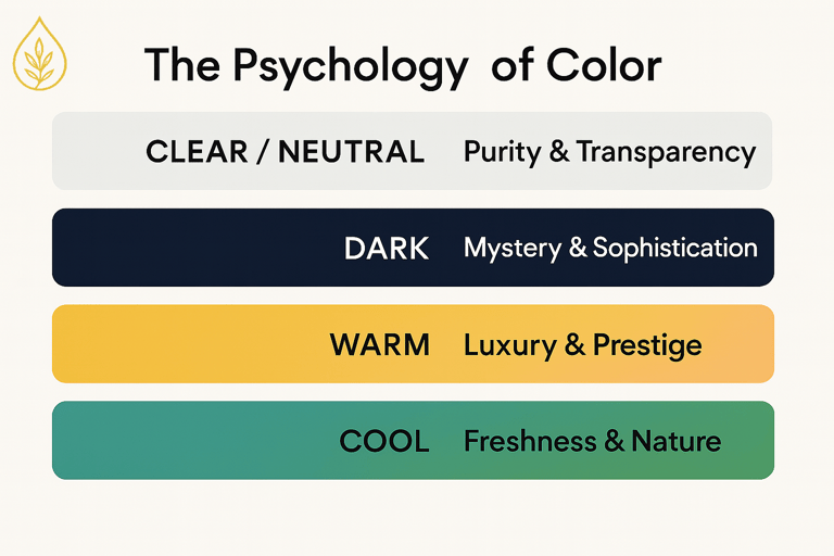
Colors heavily influence perception and often guide subconscious decisions. Clear bottles or neutral colors suggest purity, cleanliness, and transparency. These tones work especially well for scents marketed as fresh, airy, or clean. Conversely, darker colors, like deep blues, blacks, or purples, evoke mystery, intensity, and sophistication. YSL’s Black Opium leverages this dark allure to resonate with individuals seeking deeper, more sensual experiences.
Warm colors, such as gold, amber, or rose, symbolize luxury, warmth, and richness, attempting to target consumers who desire indulgence and comfort. Dior’s J’Adore, encased in golden tones, communicates opulence and a sense of timeless luxury. Cool tones like blues or greens communicate freshness, relaxation, and nature, as exemplified by fragrances like Davidoff’s Cool Water.
Textures and Finishes
The tactile experience also significantly influences consumer psychology. Smooth glass conveys simplicity, purity, and modernity, while frosted or textured glass suggests sophistication, exclusivity, and craftsmanship. For instance, the classic frosted glass bottle of Acqua di Gio communicates a sense of coolness and tranquility, which nicely aligns with its marine-inspired scent.
Matte finishes, increasingly popular in contemporary designs, signify understated luxury, subtlety, and exclusivity. Conversely, glossy finishes imply boldness, clarity, and directness. Consumers subconsciously associate these tactile experiences with the brand's character, which informs their choices even before they experience the fragrance itself.
Cultural Semiotics: Contextualizing Design Choices
Semiotic meanings are not universal; cultural context significantly shapes interpretation. While gold universally suggests luxury, specific shapes or colors might carry varied meanings globally. For example, red symbolizes good luck and prosperity in many Asian cultures but can imply passion or intensity in Western contexts.
Brands expanding into global markets must carefully consider how their designs communicate within different cultural frameworks. Jo Malone's simple, transparent bottle and minimalist aesthetic appeal widely as it offers universal elegance without strong cultural connotations. Meanwhile, luxury Middle Eastern fragrances often feature intricate detailing and heavy ornamentation, resonating strongly within their cultural context.
How Semiotics Influence Buying Decisions
When confronted with numerous fragrance choices, consumers often rely on subconscious reactions triggered by semiotic cues. A beautifully designed perfume bottle not only enhances the fragrance but also becomes part of a personal aesthetic, displayed proudly as a symbol of identity and taste.
The intricacies between shape, cap design, color, and texture silently communicates brand values and personality traits. This is why brands always try to find ways to design bottles that align subconscious cues with consumer aspirations. Luxury brands know this especially well, investing significant resources in designing bottles that amplify desirability and resonate deeply on an emotional level.
In a marketplace saturated with choices, the subtle language of perfume bottle design acts as a powerful differentiator, quietly but decisively influencing purchasing decisions, and we think you should be aware of this.